Semantic Colors are the status and feedback colors that appear throughout the checkout flow, form validation, and system messages: independent of your brand palette. They're auto-populated by your theme but can be overridden here.
Semantic Colors
Info--in
Color for informational messages and neutral status indicators. Appears in info banners, help text tooltips, and status badges that communicate context without urgency. Typically blue.
Info Content--inc
Text and icon color rendered on Info-colored backgrounds. Must contrast against Info.
Success--su
Color for success states: registration confirmation messages, valid form field indicators, completed payment confirmations, and "ticket added" feedback. Typically green.
Success Content--suc
Text and icon color on Success-colored backgrounds.
Warning--wa
Color for warning states: limited ticket availability alerts, approaching registration deadlines, and anything that needs attention without being an error. Typically amber or yellow.
Warning Content--wac
Text and icon color on Warning-colored backgrounds. Yellow Warning backgrounds often require dark text to pass contrast: check with the Accessibility Scan.
Error--er
Color for error states: failed form validation, payment processing errors, and system error messages. Typically red. This color appears prominently during checkout: make sure it's clearly distinguishable from Primary and Accent.
Error Content--erc
Text and icon color on Error-colored backgrounds.
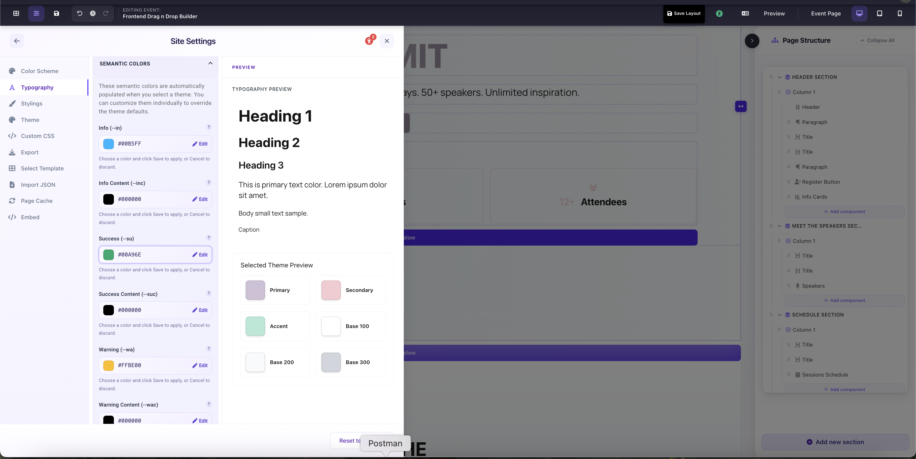
Site Settings → Typography → Semantic Colors: Info, Success, Warning, and Error color fields