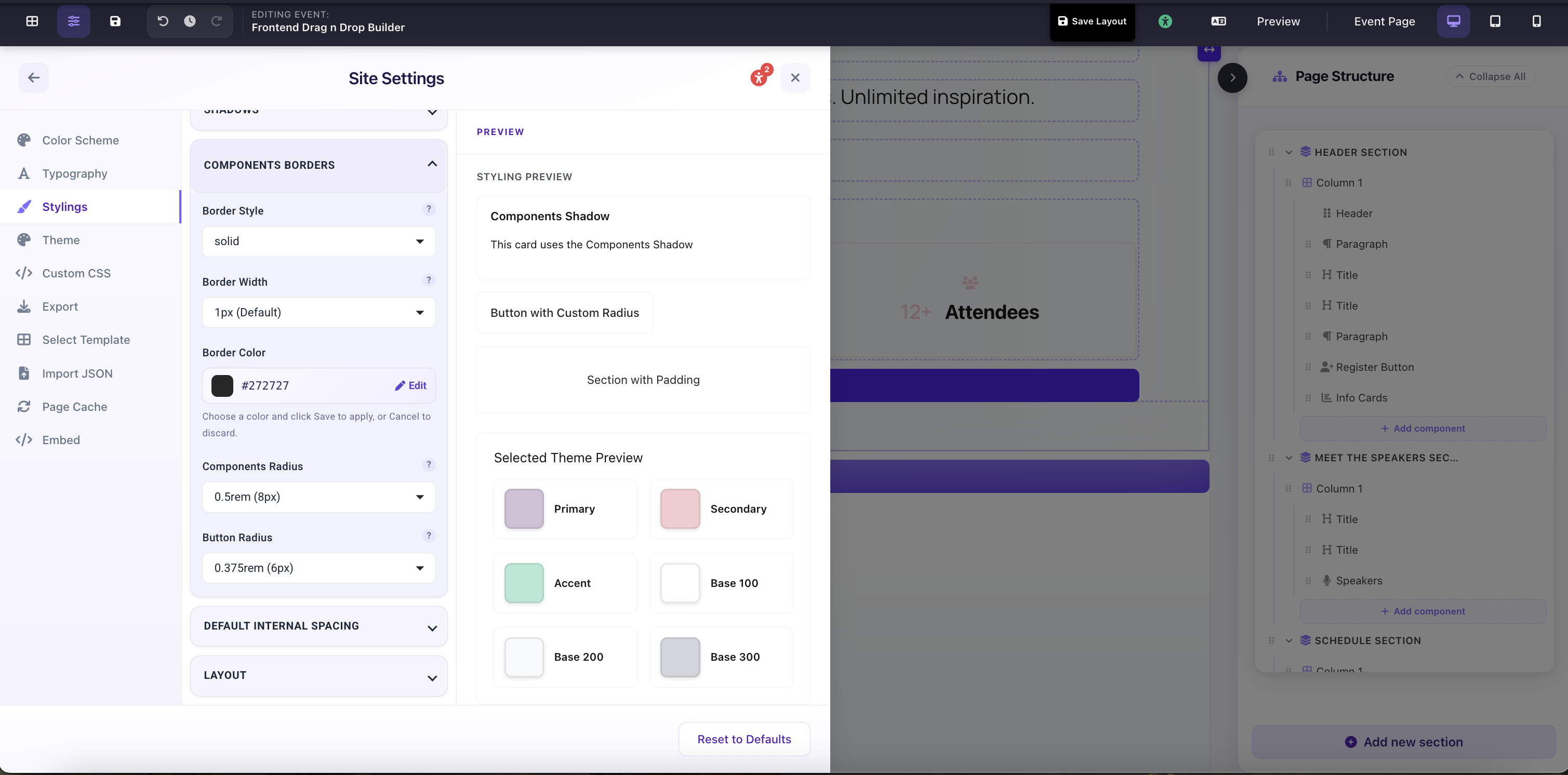
Component Borders controls the border applied to card-style components across the entire page: the same components that receive the Component Shadow. These settings work independently of per-component border overrides.
Component Borders
Border Width
Thickness of the border on card components. 0px removes all borders; 1px is the standard hairline used in most themes. Increasing width adds visual weight: use sparingly alongside shadows.
Border Style
The CSS border style: Solid (most common), Dashed, Dotted, or None. Only visible when Border Width > 0px.
Border Color
Color of the border. Typically set to --b3 (Base 300) so it automatically shifts when you change themes. Override with any color: a soft neutral or brand tint both work well.
Components Radius
Corner radius applied to card-style components: Info Cards, Speaker cards, Sponsor tiles, FAQ panels, and section backgrounds. Common values: 0rem (sharp), 0.5rem (default 8px), 1rem (rounded), 1.5rem (very rounded). This is separate from Button Radius. You can have pill-shaped buttons alongside sharp-cornered cards, or vice versa.
Button Radius
Corner radius applied to all buttons across the page: synced with the same field in the Theme Creator. Common values: 0rem (sharp square), 0.375rem (subtle), 0.75rem (rounded), 9999px (full pill). Affects Primary, Secondary, Accent, Register Button, and Social Share Button.
Site Settings → Stylings → Component Borders: Border Width, Style, Color, and Button Radius fields