Page Designer
Each nav item has a Label, a URL, and an optional Icon. Click + in the Navigation panel to add items, then click the edit icon on any item to expand its fields.
Label
The visible text for the nav item: e.g. "Home", "Schedule", "Tickets". Keep labels short so they fit comfortably on tablet viewports.
URL: Link to a page section
Set a Section ID on the target section (Section → Content tab → "Section ID" field, e.g. register), then enter #register as the URL. Clicking scrolls the visitor to that section.
URL: Link to a tab inside a Tabs component
Use the format #section-name:tab-id: for example #agenda:schedule. The Tabs component must have a matching Section ID and tab ID. Clicking activates that tab and scrolls to it.
URL: Link to an external website
Paste any full URL (e.g. https://yoursite.com). Use Open in new tab to avoid navigating visitors away from the event page.
Available sections & tabs
A dropdown that lists every section with a Section ID and every tab on the page. Select one to auto-fill the URL field with the correct anchor format: no need to type it manually.
Icon
Each nav item can display a leading icon from the icon picker. Icons appear in the desktop nav, the hamburger dropdown, and the mobile bottom bar. Use them to make links quicker to scan.
Set as Active
Marks this nav item as the currently active page link (applies the active highlight style). Useful for multi-page sites where you want to indicate which section the visitor is on.
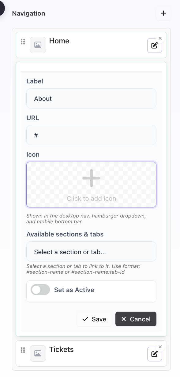
Header Navigation tab: Label, URL, Icon picker, Available sections & tabs dropdown