Page Designer
The Header component adds a navigation bar to the top of your page. Only one Header is allowed per page: keep it in its own section at the very top of the canvas.
Sticky Header
The header follows the visitor as they scroll down the page, keeping navigation always accessible. Recommended for long pages with multiple sections.
Auto-hide on Scroll
Header slides out of view when scrolling down and reappears when scrolling up. Saves viewport space while keeping the nav reachable. Works best combined with Sticky.
Glass Effect
Applies a frosted-glass backdrop blur behind the header. Creates depth on pages with colorful or image-heavy backgrounds without fully hiding the content behind it.
Mobile Bottom Bar
On mobile viewports, moves the nav links to a fixed bottom tab bar (the familiar iOS/Android pattern). The top header keeps the logo and buttons; navigation moves to the bottom edge.
Hide Desktop Navigation Menu
Removes the nav links from the desktop header entirely. Useful when the page is a single-screen registration form and you don't need navigation.
Hide Language Selector
Removes the language switcher from the header. Enable this if your event is single-language and you want a cleaner header.
Hide the Back to Event Group
Removes the "← Back" link that appears when the event belongs to a group. Useful when you want visitors to stay on the event page without a way back to the group listing.
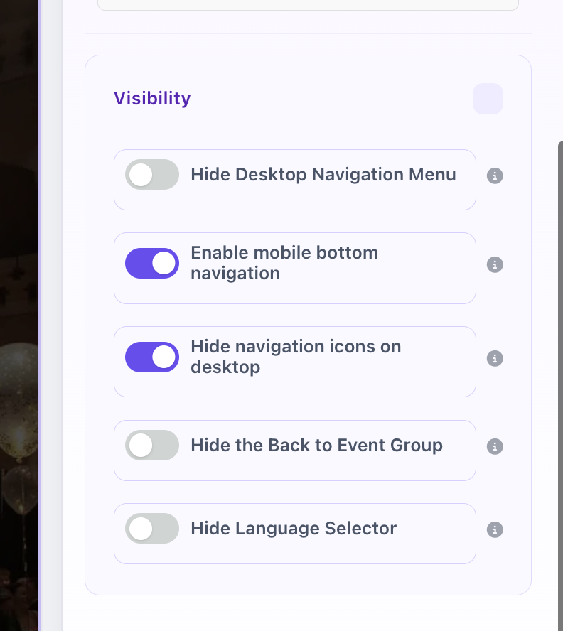
Header component: Visibility settings tab