The Title Gradient controls the colors used when Gradient Text is enabled on a Title, Event Title, or Hero component. Instead of a flat heading color, the text fills with a multi-color gradient, which is most effective on dark-theme pages where a vibrant headline creates a strong focal point.
Title Gradient
Start
First color in the text gradient fill. Defaults to Primary Button Color: the left edge of gradient headings. For a two-tone look, set Start to your Primary and End to your Accent.
Middle
Mid-color in the text gradient. Defaults to Primary ~25% lighter. Creates a visible shift across longer headings. Set this close to Start or End to make the gradient nearly linear between just two colors.
End
Final color in the text gradient. Defaults to a further derivation of Primary. For a vibrant headline, try setting End to your Accent color.
Style
Direction of the gradient across the text: Linear 90° is standard for left-to-right color shift on headings. Radial options create a spotlight effect emanating from the center or corners of the text.
💡Gradient text is enabled per-component: set colors here globally, then toggle Gradient Text on in the individual Title, Event Title, or Hero component settings.
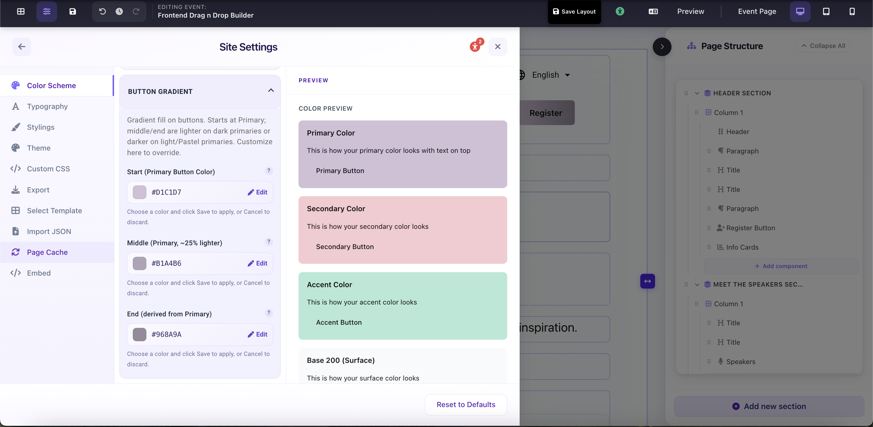
Site Settings → Color Scheme → Title Gradient: 3-stop gradient applied to heading text