The Button Gradient controls the colors used when a gradient style is selected on a Button, Register Button, or Hero CTA component. Instead of a flat background fill, the button surface transitions across up to three colors, which is useful for creating a distinctive CTA that stands out from standard Primary or Accent buttons.
Button Gradient
Start
First stop on the button background gradient. Defaults to Primary Button Color. This is the color at the leading edge of the button.
Middle
Midpoint stop. Defaults to Primary ~25% lighter. Widen the gap between Start and Middle for a dramatic gradient; keep them close for a subtle sheen.
End
Final stop. For a two-tone brand gradient button, set Start to Primary and End to Accent. This is a common and high-impact combination.
Style
Direction of the gradient across the button surface. Linear 90° (left → right) is the most common for buttons. Radial creates a circular glow effect from the center of the button.
💡Gradient fill on buttons is enabled per-component: set the colors here globally, then select "Gradient" as the button style in the individual Button or Register Button component settings.
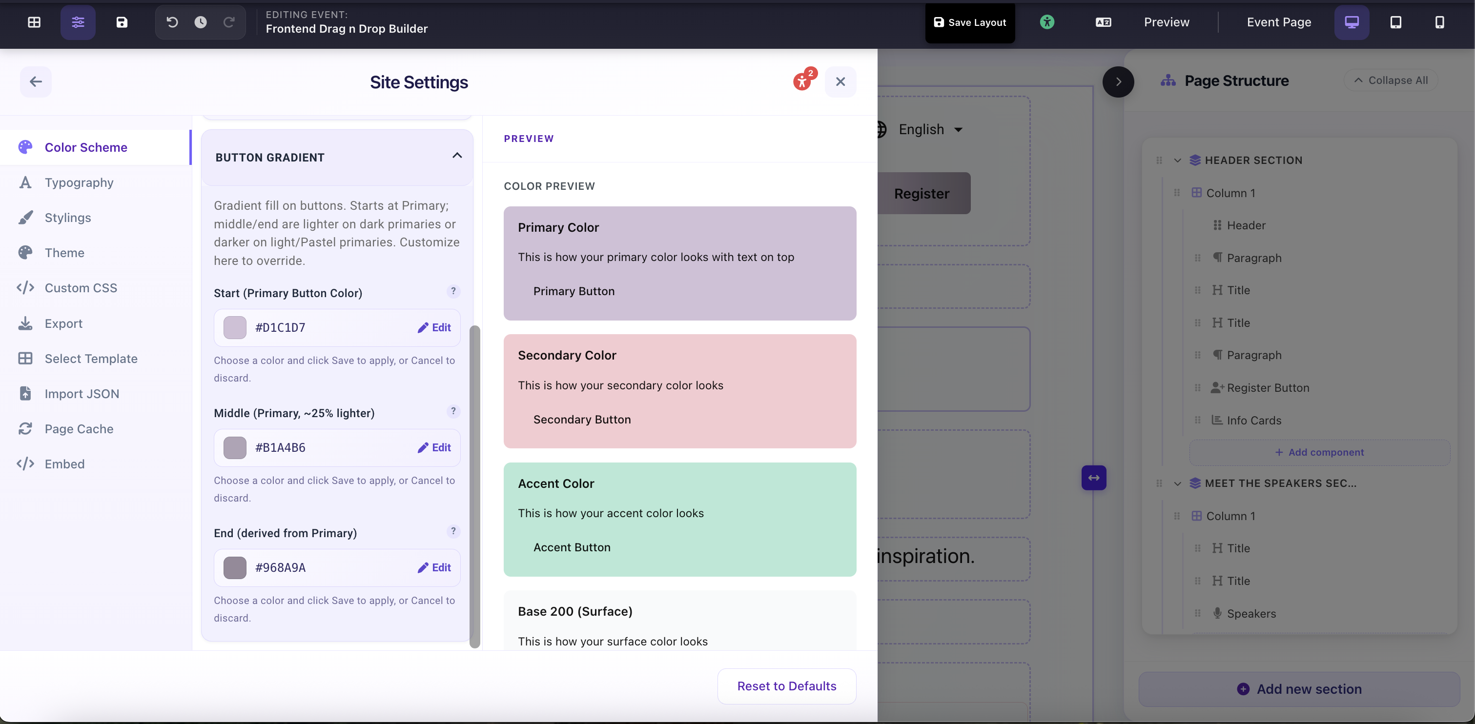
Site Settings → Color Scheme → Button Gradient: 3-stop gradient fill for gradient-style buttons