When you want to build a consistent color system from scratch, use the Theme Creator. Fill in the fields below and click Save & Auto-Fill the rest. The wizard propagates your choices across all Color Scheme settings, Typography font colors, and button styles automatically.
Identity & Foundation
Theme Name
Internal identifier for the saved theme. Lowercase letters a–z only, 2–48 characters, no spaces or numbers. Once saved, the theme appears under Your Org Themes and can be applied to any future event without re-entering colors.
Background--b1
Sets Base 100: the primary page background. The wizard derives Base 200 and Base 300 automatically by darkening this value. Use your lightest brand color or #ffffff for a clean white canvas.
Text on base--bc
Sets Base Content: the default body text color. Must contrast strongly against Background. #1f2937 (near-black) works for most light backgrounds; use a light color like #e5e7eb for dark backgrounds.
Brand Colors
Primary
Your main brand color. Sets --p and drives the derived button colors, gradient starts, and link colors across the entire Site Settings. This is the most impactful field in the wizard.
Text on primary
Sets Primary Content (--pc). The label color inside all Primary-style buttons and elements. Choose white for dark primaries, dark for light primaries.
Secondary
Sets --s. A complementary brand color for secondary buttons and supporting UI elements. Works best when it reads clearly alongside Primary without competing with it.
Text on secondary
Sets Secondary Content (--sc). Label text inside Secondary buttons.
Accent
Sets --a. Your highlight color for badges, accent buttons, countdown highlights, and hover states. Best used as a bold third color that stands out from both Primary and Secondary.
Text on accent
Sets Accent Content (--ac). Label text inside Accent buttons and on Accent-colored surfaces.
Button Radius
Default Button Radius
Sets the border-radius applied globally to all buttons on the page: Primary, Secondary, Accent, Register Button, and Social Share. Same setting as Site Settings → Stylings → Button radius, synced both ways. Common values: 0rem for sharp/square, 0.375rem for subtle rounding, 0.75rem for rounded, 9999px for full pill shape.
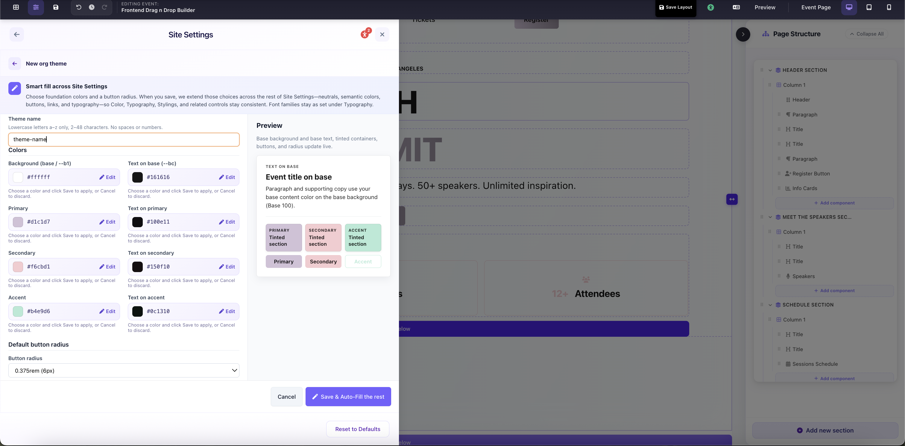
Theme Creator wizard: foundation colors, text-on pairs, button radius, and live preview panel