Font Colors
When you want to control the text hierarchy across your event page, use Font Colors to set three levels of text prominence, including primary, secondary, and muted. These settings apply specifically within content components and work alongside your Base Content token to create a consistent reading experience.
Font Color Primary
The main foreground text color for paragraphs, body copy, card descriptions, form labels, and most visible text in content components. This is what your visitors read most: choose a color with strong contrast against your Base 100 background.
Font Color Secondary
A softer text color for supporting descriptions, subtitles, metadata, and helper text. Appears on speaker bios, event sub-headings, and any text that should be visible but recede behind the primary copy.
Muted Color
The dimmest text color for placeholder text, disabled states, captions, and fine print. Should still be legible but clearly less prominent than Secondary. Run the Accessibility Scan after adjusting: Muted is the color most likely to fail contrast checks.
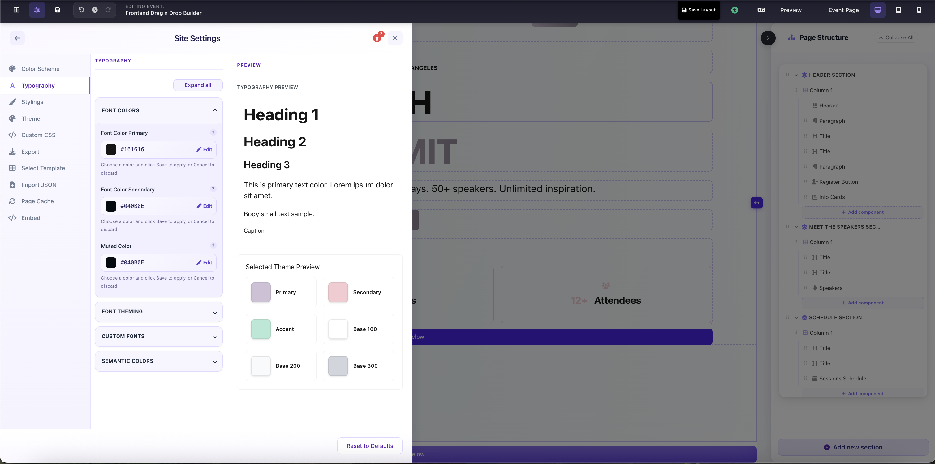
Site Settings → Typography → Font Colors: Primary, Secondary, and Muted color fields with live Typography Preview