Button Colors
Button Colors let you fine-tune the background and text colors for Primary, Secondary, and Accent buttons in both their default and hover states. These values are pre-filled from your theme tokens automatically. Only override them here if you need a specific color that differs slightly from your theme, for example, a brand button color that doesn't exactly match your Primary.
Primary Button Color
Background fill of Primary-style buttons in their default (non-hovered) state. Applies to: Register Button, primary Hero CTAs, and any Button component set to "Primary" style.
Primary Button Text Color
Label text color on Primary buttons. Must contrast against Primary Button Color. Usually white on dark primaries, dark on light primaries.
Primary Button Hover Color
Background of Primary buttons when a visitor hovers. Typically a darker or lighter variant of Primary Button Color to signal interactivity.
Primary Button Hover Text Color
Label text color on Primary buttons during hover. Can match Primary Button Text Color or shift for extra visual feedback.
Secondary Button Color
Background of Secondary-style buttons at rest. Applies to any Button component set to "Secondary" style, and the optional secondary action in Hero and Header.
Secondary Button Text Color
Label text color on Secondary buttons. Must contrast against Secondary Button Color.
Secondary Button Hover Color
Background of Secondary buttons on hover.
Secondary Button Hover Text Color
Label text on Secondary buttons during hover.
Accent Button Color
Background of Accent-style buttons at rest. Use Accent buttons to draw extra attention to a specific CTA: e.g. a "Limited Spots" ticket tier button.
Accent Button Text Color
Label text on Accent buttons. Must contrast against Accent Button Color.
Accent Button Hover Color
Background of Accent buttons on hover.
Accent Button Hover Text Color
Label text on Accent buttons during hover.
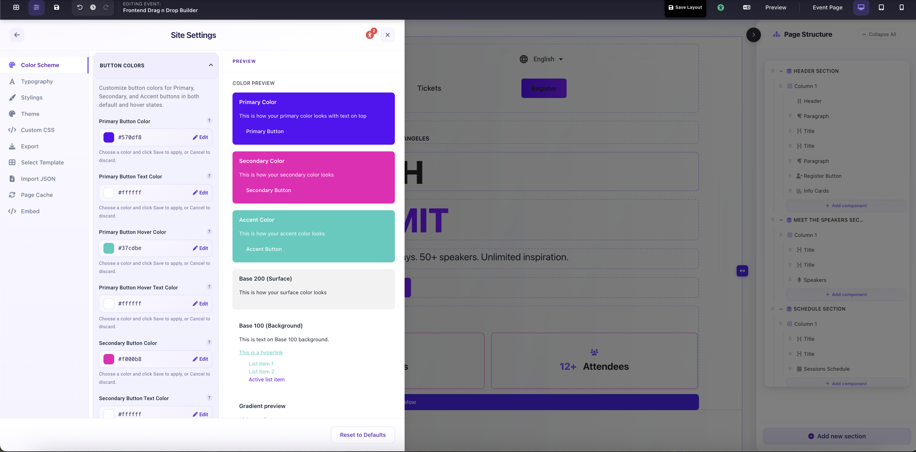
Site Settings → Color Scheme → Button Colors: per-type overrides for Primary, Secondary, and Accent button default and hover states