Layout controls two things: the gap between columns inside sections, and the maximum width of all page content on desktop. These are among the highest-impact settings in the Page Designer: a single switch can transform a page from edge-to-edge immersive to a clean centered article layout.
Each content width option shows a scaled preview: a stand-in for a 1600px-wide desktop, where the bar width shows exactly how much horizontal space your content uses in that viewport.
Default Column Gap
Column Gap
The default horizontal space between columns inside every section. Dropdown presets range from 0px to 48px. Default is 10px. This applies to all new sections: existing sections can override it under their individual Section settings.
Content Width Options
Full Width
Content uses the full viewport width with no max-width cap on the page container. Best for immersive designs where sections and backgrounds bleed edge-to-edge: great for dark-theme pages with full-width hero images and background videos.
Expanded
Content is limited to 98vw on desktop: a subtle margin appears at the edges, but mobile stays full width. Gives a slight frame without the strict constraint of a boxed layout.
Boxed (1280px)
Content is capped at 1280px and centered. The most common choice for professional event pages: keeps line lengths readable and prevents overly wide text columns on ultra-wide monitors.
Full-width header, boxed content
Header sections span edge-to-edge; all other sections use a 1280px centered column. Ideal for a spanning navigation bar with a structured content area below: the most popular hybrid layout for event pages.
Full-width header & footer, boxed body
Header and Footer sections span the full viewport; all body sections use a 1280px centered column. Use when you want both your navigation and footer to feel full-bleed while keeping the middle content structured.
Custom max width
Set any valid CSS max-width (e.g. 1100px, 72rem, 90vw). Applied to the page content container on desktop. Use when your brand guidelines specify a non-standard grid width.
💡Why this matters: choosing Full Width on a light-theme page with narrow text columns makes paragraphs stretch uncomfortably wide on 4K monitors. Switching to Boxed (1280px) immediately solves readability: lines stay under 80 characters and the page feels intentionally designed rather than stretched.
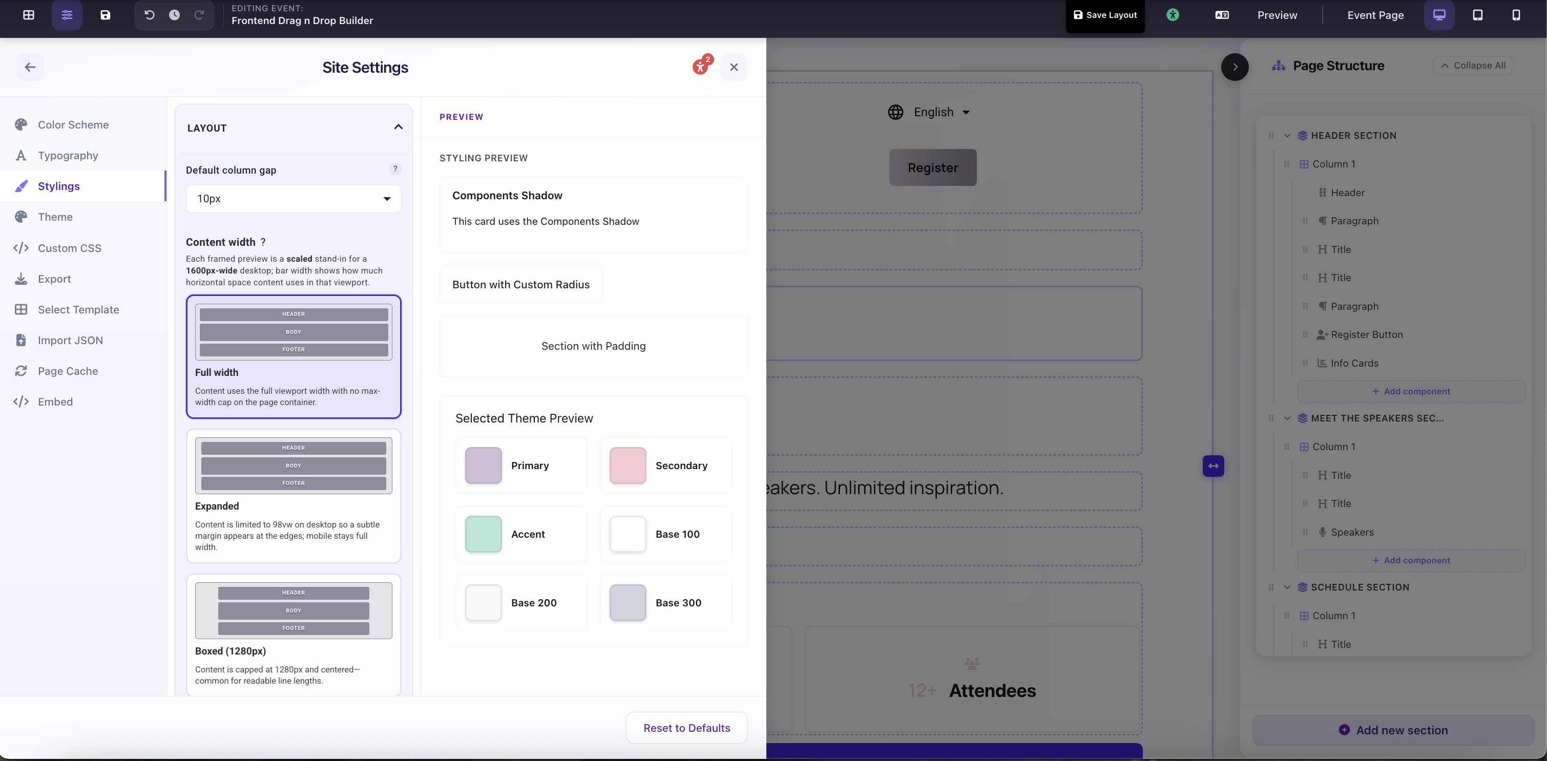
Site Settings → Stylings → Layout: Default Column Gap and Content Width selector with scaled visual previews for each option