Click the sliders icon in the toolbar to open Site Settings. The left nav has 10 sections: start with Color Scheme.
At the top is the Theme Creator button: a wizard that fills all color tokens from just 3–4 brand colors. Below it, you can expand and override individual tokens:
- Theme Colors: Primary, Secondary, Accent, Base layers (100–300), Neutral
- Link & List Elements: Hyperlink, hover, list item colors
- Button Colors: Per-type overrides (Primary / Secondary / Accent)
- Gradients: Site, Title, and Button gradients (3-stop + direction)
The Color Preview panel on the right shows live swatches so you can check contrast before saving.
💡Click "Expand all" at the top of the Color Scheme panel to open every accordion at once: great when you need to audit all tokens together.
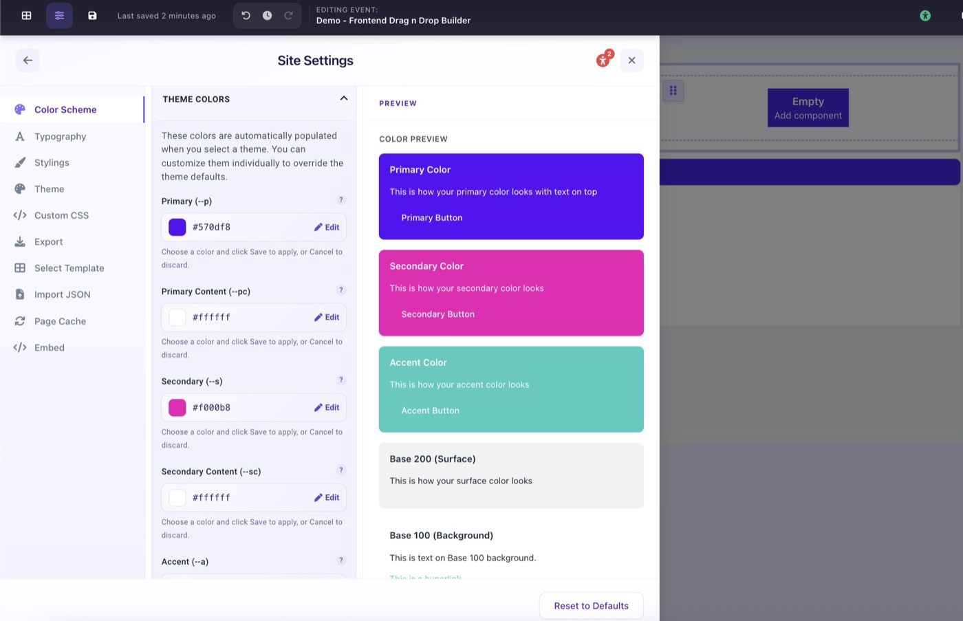
Site Settings open on the Color Scheme panel