Before publishing, use the three device buttons in the top-right toolbar to preview your layout at each breakpoint:
- 🖥️ Desktop: full-width canvas (default editor view)
- 📱 Tablet: ~820px canvas width
- 📱 Mobile: ~390px canvas width
All sections and components reflow responsively: check each view before going live.
Click Preview to hide all editor chrome and see the page exactly as a visitor would. A floating "Back to Editor" pill appears in the corner when you're done.
The layout autosaves about five seconds after your last change. When you're ready, click Event Page in the toolbar to open the live published page in a new tab.
💡Run the Accessibility Scan before clicking Event Page: a quick check for contrast issues and missing alt text protects all your visitors.
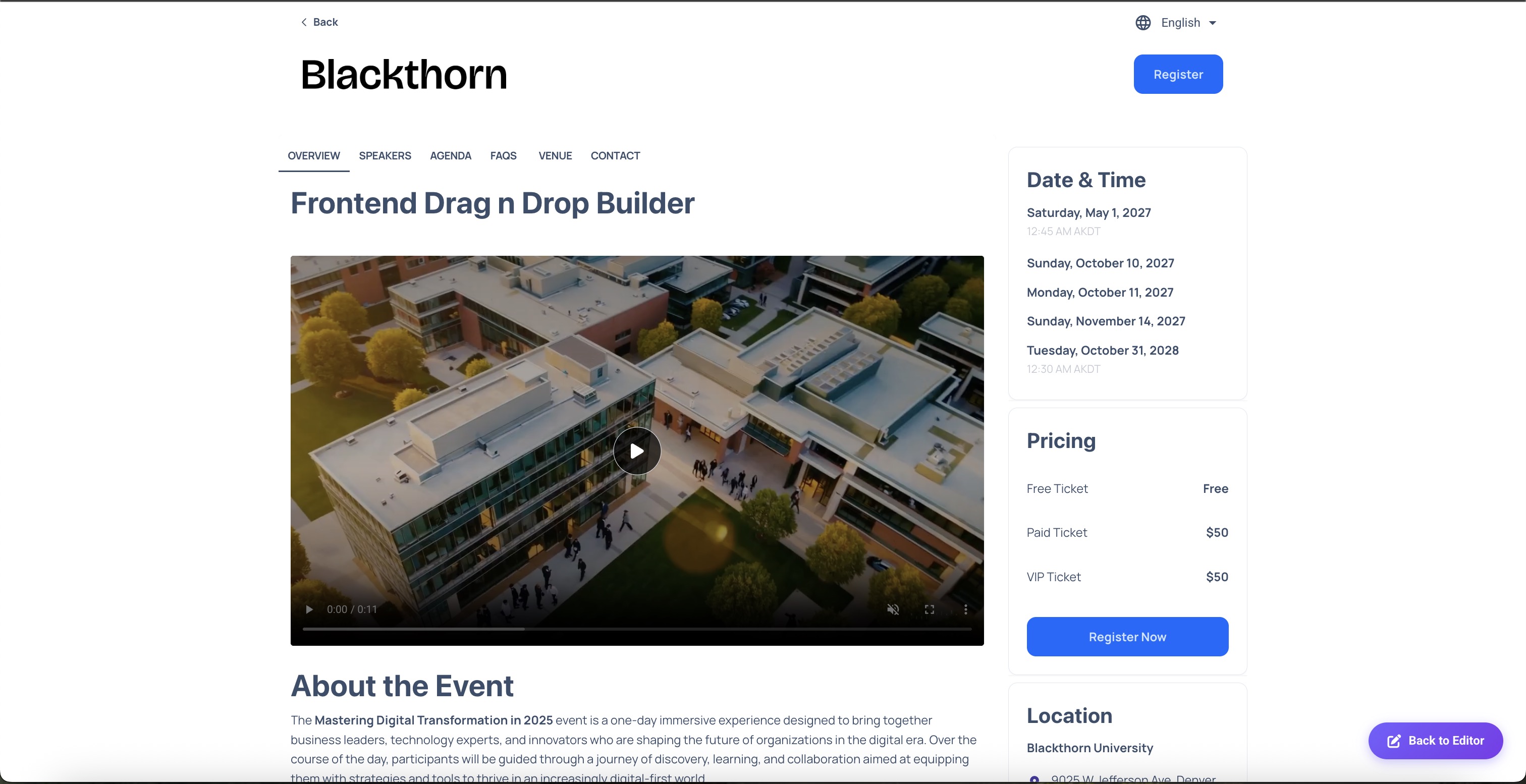
Toolbar right-side: device view buttons, Preview, and Event Page