Theme Colors are the 12 foundational CSS tokens that drive every color decision on your event page. When you select a built-in theme or run the Theme Creator, these are auto-populated. You can override any of them individually without touching the rest.
Primary & Secondary
Primary--p
Your dominant brand color. Drives primary buttons, active tab underlines, selected navigation items, focus rings, and progress indicators across the page. The most visible color on the canvas.
Primary Content--pc
Text and icon color rendered on top of Primary backgrounds. Used as the label color inside primary buttons. Must contrast strongly against Primary: choose white for dark primaries, dark for light primaries.
Secondary--s
A supporting brand color for secondary buttons and secondary UI elements. Works best as a complement to Primary, not a duplicate of it.
Secondary Content--sc
Text and icon color on Secondary backgrounds. Used as the label color inside secondary buttons. Same contrast rules as Primary Content.
Accent
Accent--a
Your highlight and emphasis color. Appears on accent buttons, badges, countdown box highlights, active list items, and hover states on certain interactive elements. Best used sparingly for maximum visual impact.
Accent Content--ac
Text and icon color on Accent backgrounds. Used as the label color inside accent buttons. Must contrast against Accent.
Neutral
Neutral--n
A dark neutral surface color. Used for dark card backgrounds, dark navigation bars (when Glass Effect is off), neutral-style buttons, and any component where a dark-but-not-quite-black surface is needed.
Neutral Content--nc
Text and icon color on Neutral backgrounds. Used for nav link text and icons on dark headers, and for label text inside neutral-style buttons.
Base Layers
Base 100--b1
The primary page background. Every section's default background color. Also the starting color for the Site Gradient when enabled. On light themes this is typically white or very light gray; on dark themes it's the darkest surface.
Base 200--b2
A slightly elevated surface. Used for card backgrounds, input field fills, panel backgrounds, and any surface that sits one layer above the page background. The ending color for the Site Gradient.
Base 300--b3
The darkest base surface. Used for borders, dividers, pressed/active states on interactive surfaces, and deeply nested backgrounds. Provides visual separation without using a full Neutral color.
Base Content--bc
The default body text color for content rendered on Base 100. Applied to paragraphs, form labels, list text, and general copy throughout the page. Should contrast strongly against Base 100.
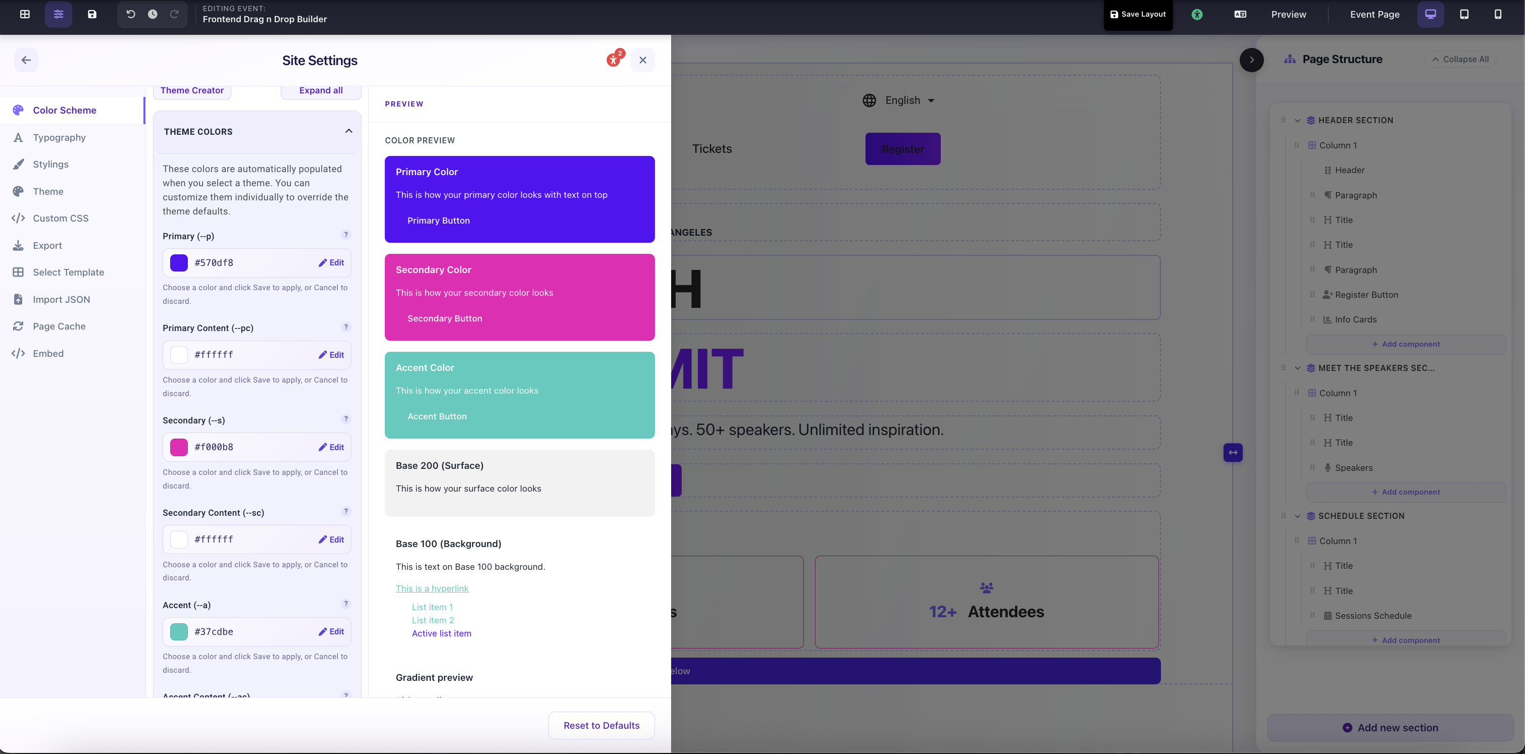
Site Settings → Color Scheme → Theme Colors: Primary, Secondary, Accent and Base token fields with live color preview