With the Header in place, start building the body of your page by adding sections. Each section is a full-width row that holds one or more columns, and each column holds one or more components.
Click + Add new section at the bottom of the canvas to insert a section, then open the Content tab in the right sidebar to configure it:
Column Distribution
Choose how many columns the section has (1–5) and how the width is split: Full width, 50/50, 67/33, 33/67, 75/25, and more. Pick the layout that best matches the content you'll place in it.
Desktop vs. Mobile / Tablet
On Desktop, the page respects the exact column distribution you set. On Mobile and Tablet, all sections default to a single-column stacked layout: columns flow vertically, top to bottom. This ensures every page is responsive out of the box without any extra configuration.
Adding components to a column
Click Add component inside any column to open the component selector. You can add one or multiple components to the same column. They stack vertically within it. For example, a column might hold a Title, then a Paragraph, then a Button, all stacked in order.
💡A common pattern for registration pages: a 2-column section (67/33) with event details (Title + Date & Time + Info Cards) on the left and the Checkout Form on the right: visitors can read and register without scrolling.
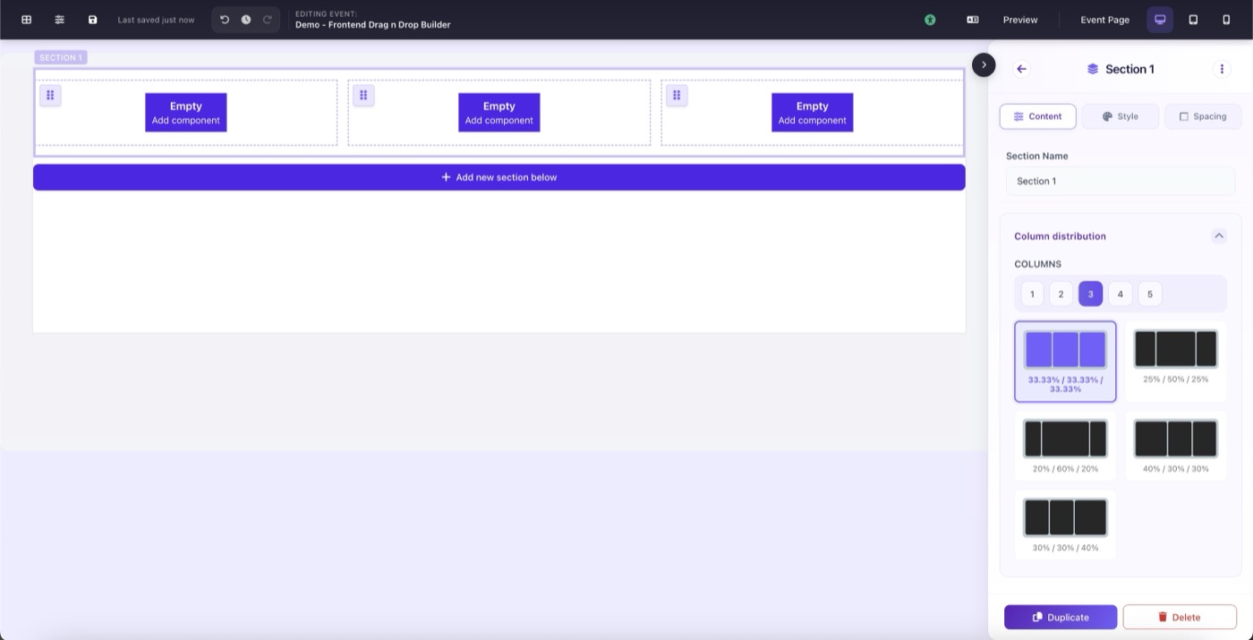
Section settings panel: Content tab showing column distribution options