Important Configuration Step
If you are an existing Blackthorn customer, you need to add the “Dynamic” value to the Event's UI Experience field's picklist. The “Dynamic” picklist value will be added automatically for new installations.
To add the “Dynamic” value to the UI Experience field's picklist, complete the steps below.
Click the Gear icon in the upper right-hand corner.
Click Setup.
Click the Object Manager tab.
Search for and click “Event”.
Click Fields & Relationships.
Search for and click “UI Experience”.
In the Values section, click New.
Add “Dynamic”.
Click Save.
What is Supported by Each User Interface?
The following chart shows the features we currently support for each user interface (UI).
Yes = Supported
No = Not supported, but may work in certain scenarios
Feature | Dynamic | Tabbed | Simple | Full-Width |
|---|---|---|---|---|
ADA & WCAG Accessibility (VPAT) | Yes | Yes | Yes | Yes |
AttendeeLink | Yes | Yes | Yes | Yes |
Attendee Tab | Yes | Yes | No | No |
Color Theme | Yes | Yes | Yes | Yes |
Custom Questions (Forms) | Yes | Yes | Yes | Yes |
Custom Content | Yes | Yes | No | Yes |
Data Dictionary / Translations | Yes - 3 | Yes | Yes | Yes - 1 |
Discount Codes | Yes | Yes | No | Yes |
Display Density | Yes | No | No | No |
Donations (Event Item) | Yes | Yes | No | Yes |
Free Events | Yes | Yes | Yes | Yes |
Paid Events | Yes | Yes | No | Yes |
FAQs | Yes | Yes | No | Yes |
Group Registration | Yes | Yes | No | Yes |
iframes | Yes | Yes | Yes | Yes |
Images | Yes | Yes | Yes | Yes |
PayLater | Yes | Yes | No | Yes |
Pre-checkout and Checkout Details | Yes | Yes | No | Yes |
reCAPTCHA | Yes | Yes | Yes | Yes |
Session Registration | Yes | Yes | No | Yes |
Sessions | Yes | Yes | No | Yes - 2 |
Speakers | Yes | Yes | No | Yes |
Sponsors | Yes | Yes | No | Yes |
Tracks | Yes | Yes | Yes | Yes |
Webinar Integrations | Yes | Yes | Yes | Yes |
Visibility Control | Yes | Yes | Yes | Yes |
Waitlisting | Yes | Yes | Yes | Yes |
1 - Currently, the language selector is not visible for the Full-Width UI. Users can set the language using URL parameters instead.
2 - The Full-Width UI supports Sessions in the following scenarios.
Free Events with multiple Event Items
Paid Events with one or more Event Items
For free Events with a single Event Item and one or more Sessions, we recommend using the Tabbed UI. If you use the Full-Width UI, your Attendees can only register for Sessions via their AttendeeLink.
3 - To ensure that Static Translations works, your org will need "TRANSLATION_ENABLED" set to true on the license metadata.
UI Experience Field Setup
The following steps are for existing customers only.
Complete the steps below to add the UI Experience field to the Event record's page layout.
- Go to Setup.
- Navigate to Object Manager.
- In the Quick Find box, enter and click "Event" (conference360__Event__c).
- Click the Page Layouts tab.
- Click Event Layout.
- Locate the UI Experience field and drag and drop it onto the page layout.
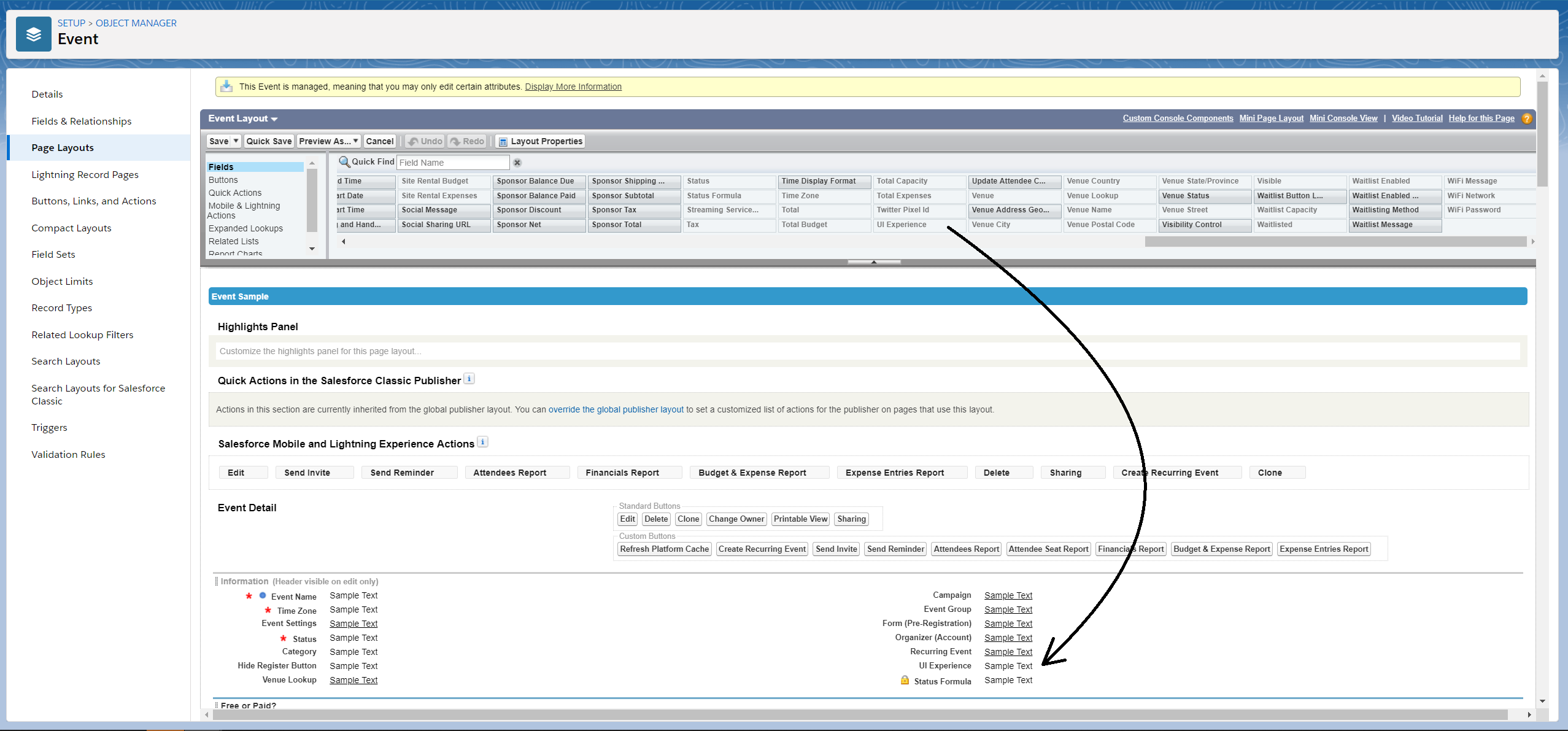
- Click Save.
Functionality
Accessibility
Attendees can change the accessibility options (Virtual Keyboard, Accessible Mode, Content Adjustments, Color & Display Adjustments, and Navigation Adjustments) on the Event landing page.
Contact Us Form
When an individual sends an email from the Contact Us on the Event page and the UI Experience is set to “Dynamic UI”, the subject line on the email received by the Event Planner will include both the Event Name and the Subject from the Contact Us .
On the Event page, Attendees can click the Contact Us tab and go to the Contact Us section. There, Attendees can fill out the Contact Us and send the message to a previously defined person.
Content
Attendees can navigate through the content on the Event landing page.
If an Event does not have any related Event Content records, the Attendee will not see the Content tab on the navigation bar.
If the Event Settings has Custom Tabs = “Hide” then the Attendee can not see the Content tab on the navigation bar.
If an Event has at least one related Event Content record, the Attendee will see and can click the Content tab on the navigation bar.
After clicking the Content tab on the navigation bar, the Attendee will see the content defined for the Event, including the name (Content Name field), description (Description field), and content link (URL field).
An Attendee can see an Event’s downloadable Content files in the “Downloadable Content” section on the Event landing page. The files will be listed in descending alphabetical order. Clicking the Download button will cause a new browser tab to open with the URL related to the file. To make a file description appear, an Attendeewill need to perform one of the following tasks.
Desktop: hover over a file name
Mobile Device: tap the file name
Dates
The Date format in Dynamic UI follows the same logic and pattern as the Full-Width UI. (Ex. Wednesday, April 6, 2022, 9:00 AM to Friday, June 30, 2023, 9:00 AM ET)
The logic for the date fields in the Dynamic UI is the same as the logic in the Full-width UI.
The “to” that joins the start and end dates is the label: LBL_DATE_CONJUNCTION_TO, which can be updated to a different value such as a hyphen.
If Hide Timezone = “True” on the Event Settings, the time zone will not be displayed.
If the Event Start Date is the same as the Event End Date or the Event End Date is blank, the format will change to Wednesday, April 6, 2022, 9:00 AM to 10:00 AM ET.
If the Event End Date and Event End Time are blank, the format will change to Wednesday, April 6, 2022, 9:00 AM.
If a value is selected for the Date Format field on the Event Settings, that format will override the [weekday], [month] [day], and [year] portion of the date formatting.
Event Items
Tickets
If an Event has either more than one Ticket option or at least one paid Ticket, the Attendee will see the Buy Ticket button in the navigation bar. After clicking the button, the Attendee will be able to purchase Tickets.
If an Event has either more than one Ticket option or at least one paid Ticket, the Attendee can click the Ticket tab in the navigation bar to see the available Tickets. If there are more than three Tickets available, the Attendee can click View All Tickets to see all of the Tickets. Each Ticketwill include the following information:
Name (Public Item Name)
Type (Type)
Description (Description)
Price (Price)
If the Ticket is a paid Ticket, the Attendee will see a Buy Ticket button. If the Ticket is a free Ticket, the Attendee will see a Get Ticket button. Clicking either button will start the Checkout process for the Attendee.
Products
When creating a Product, an Event Planner can enter a value in the Quantity Available, Minimum Quantity, and Maximum Quantity fields.
When an Attendee registers for an Event with Products available for purchase, the Attendee can use the quantity selector to add multiples of a Product to their cart.
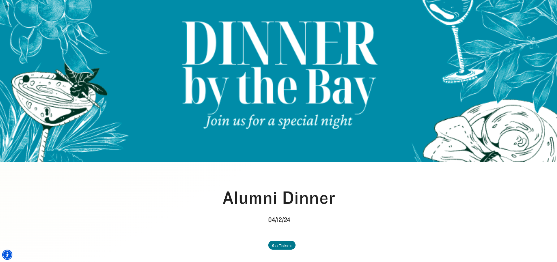
Event Page
Hero Section
On the Event Page, Attendees can see the following Event information in the Hero Section.
Banner Image (Image URL)
The recommended image size is 2500 x 731px, with a minimum of 1100 x 321px. For all other UIs, the recommended image size is 820 x 410, with a minimum of 650 x 320px.Event Name
Location (Venue City, Venue Country)
Dates/Times (Event Start Date, Event End Date, Event Start Time, and Event End Time)
Description
Featured Sponsors
Buy Ticket button
Navigation
Labels that are too long to fit across the top navigation bar are accessible via slider arrows.
Slider arrows are NOT visible when the labels fit across the top navigation bar.
The registration/call-to-action button is always visible and is not included in the slider functionality.
Display Density
Event Organizers can use the Event’s Default Display Density (conference360__Default_Display_Density__c) field to change how an Event with UI Experience = “Dynamic” appears on the Event’s webpage.
If Default Display Density = “Hide” (the default setting), the toggle button will not be visible on the Event webpage (Event Page URL).
If Default Display Density = “Comfy,” the Event webpage (Event Page URL) will load with the existing look and feel.
If Default Display Density = “Compact,” the Event webpage (Event Page URL) will load with reduced whitespace and a shortened page length.
Event Settings
Four pairs of fields were added to the Event Settings record to customize the label and URL of each visible link in the footer of a related Event. All related permission sets were updated to include the new fields.
The custom URL fields only accept domains (i.e., www, google, or com). Domain paths do not work. Custom labels will not be visible if the corresponding URL field is empty.
Custom Label 1 - Text (255)
Custom URL 1 - URL (255)
Custom Label 2 - Text (255)
Custom URL 2 - URL (255)
Custom Label 3 - Text (255)
Custom URL 3 - URL (255)
Custom Label 4 - Text (255)
Custom URL 4 - URL (255)
Frequently Asked Questions
An Attendee can now see the FAQs tab in the navigation bar on the Event page. Clicking the tab will take the Attendee to the Frequently Asked Questions section. Clicking a specific question will show all information related to that question.
The Event Admin defines the questions/answers in the Frequently Asked Questions section during the Event setup process.
The background color for the Speaker and FAQ sections will match the Background Color (#) value in the Event Settings. NOTE: The FAQ gradient overlay will still be in the Primary Color (#).
Language Selector
If the Language Selector on the Event Settings is enabled, Attendees can see the Language Selector button/dropdown on the Event page. Attendees can then choose the language they would like the content translated into.
Mobile Devices
Attendees can now navigate an Event page on a mobile device from the bottom navigation bar.
When an Attendee on a mobile device clicks anywhere on a Sponsor logo, the Sponsor page will open to show information about the Sponsor. Once the Attendee closes the Sponsor’s page, they will be returned to the section of the Event landing page they were previously viewing.
When an Attendee on a mobile device selects a Session from the Featured Sessions or All Sessions section, they will see the following.
Image (Image URL)
Session Name
Session Start Date, Start Time, End Date, or End Time
Description
Session Speakers
Once the Attendee closes the Session’s page, they will be returned to the section of the Event landing page they were previously viewing.
Mobile Device: The UI for Simple Events matches the existing design for complex Events, except for the order of components. The new order is as follows.
Banner image
Title
Location
Dates
Description
Registration Form
Register button
Thumbnail Images
Users can also show secondary thumbnail/banner images for Events with the correct aspect ratio in an Event Group on a mobile device by using the Event’s Thumbnail and Mobile Image URL field. This is especially helpful for Events using the Dynamic UI since the Dynamic UI uses a different image ratio for Banners, which results in cropped thumbnails on the Event Group webpages.
Available Banner and Thumbnail Fields
Banner: Event’s Image URL (Image_URL__c) and Image Name (Image_Name__c)
Thumbnail: Event's Thumbnail and Mobile Image URL (Thumbnail_and_Mobile_Image_URL__c) and Thumbnail Image Name (Thumbnail_Image_Name__c)
Navigation
The Attendee can see an Event landing page’s footer. The footer includes the Event Settings’ Logo URL and up to four customizable links.
When a user navigates from the Event Page Builder section to the General Info page to update the Event's dates and time and navigates back to the Event Page Builder section, they will see the updated information in the Event Page BuilderHero Section.
Sessions
When an Event has at least one Session, the Attendee can see the Schedule tab on the navigation bar and go to the Schedule section.
When an Event has no Sessions, the Attendee cannot see the Schedule tab on the navigation bar.
When an Event has at least one Session AND the Admin/Planner has hidden this section, the Attendee will not be able to see the Schedule tab on the navigation bar.
If an Event does not include any Sessions, Attendees will not see the Sessions tab on the Event page.
If the Event Settings has Sessions set to “Hide”, Attendees will not see the Sessions tab on the Event page.
If an Event includes Sessions, Attendees will see two Featured Sessions on the Sessions tab. Each Featured Session can include the following information.
Session Name
Image (Image URL)
Schedule Start Date, Start Time, End Date, or End Time)
Description
Keywords
Speaker(s)
Sponsor(s)
Attendees can use the View All / Collapse buttons to view/hide the list of Sessions.
When an Event’s UI Experience = “Dynamic,” a Session’s start and end times will appear as follows.
If a Session’s Start Time and End Time fields are populated, Attendees will only see the Session’s start/end time range.
If a Session’s Start Date and Start Time fields are populated, Attendees will only see the start date and time.
If a Session’s Start Date field is populated, Attendees will only see the start date.
If a Session’s End Time field is populated but the Start Time field is blank, Attendees will not see a start/end time range.
Simple Events
If an Attendee views a simple Event on a desktop and the Event does not include any Speakers, Event Content, FAQs, or Sponsors, the Attendee will not see the navigation bar at the top of the page. If the simple Event includes Speakers, Event Content, FAQs, or Sponsors, the navigation bar will be visible.
The user interface for Simple Events now reflects the new Dynamic UI with updates to colors, placement, size, and spacing.
The image is a banner across the top of the page with dimensions matching the complex Event design.
The Event Name, location, dates, and Description are in a column on the left side.
The Registration Form and the Register button are in a column on the right side.
Speakers
When there are no Speakers for an Event, the Speakers tab will not be visible.
If the Event Settings’ Speakers field = “Hide”, the Attendee will not be able to see the Speakers tab on the navigation bar.
When the Attendee clicks the Speakers tab in the navigation bar, they will be taken to the Speakers’ section. The Attendee will see four Speakers per row and the View All button. The Speakers will be ordered by featured Speaker(s) and then by full name. Each Speaker will include the following information:
Image (Image URL)
Name (First Name Last Name)
Organization (Company)
Position (Title)
Description (Bio)
When the Attendee clicks on a Speaker, the Attendee will see the following information about the Speaker:
Image (Image URL)
Name (First Name Last Name)
Organization (Company)
Position (Title)
Description (Bio)
Social media links (Instagram, LinkedIn, and Twitter)
Sessions where the Speaker is scheduled.
If the Attendee clicks the View All button and wants to close the expanded list, they can click the Collapse button.
The background color for Speaker and FAQ sections will match the Background Color (#) value in the Event Settings. NOTE: The FAQ gradient overlay will still be in the Primary Color (#).
Sponsors
When there are no Sponsors for an Event, the Sponsors tab will not be visible.
If the Event Settings’ Sponsors field = “Hide”, the Attendee will not be able to see the Sponsors tab on the navigation bar.
When the Attendee clicks the Sponsors tab in the navigation bar, they will be taken to the Sponsors’ section. The Sponsors will be grouped by Tier. When the Attendee hovers over a Sponsor’s logo/image, the Attendee will see the following information:
Logo (Image URL)
Name (Display Name)
Level (Tier)
Description
If an image/logo isn’t uploaded for the Sponsor, then only the text will be visible.
UI Experience
If the UI Experience = “Master” and a free Event has one Event Item and no Sessions, the user will only see a single registration form. References to Event Items and Sessions in the navigation will not be visible.
If the UI Experience = “Master” and an Event has multiple Event Items and Sessions, the user will not see the single registration form.
Venues
If the Venue section for an Event page is enabled, an Attendee will be able to see the Venue tab, click the tab, and see a map with a card that shows the address and two buttons (Get Directions and View Large Map).