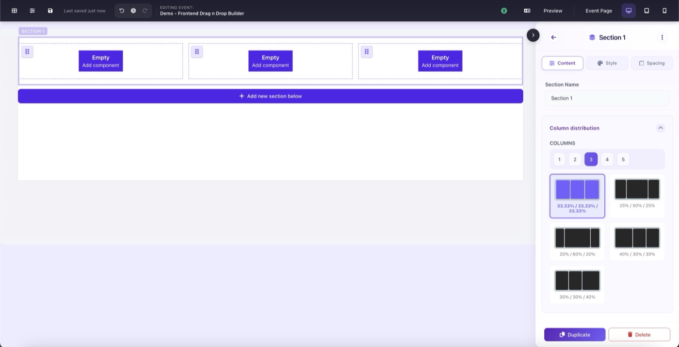
Layout Container
A Section is the top-level horizontal row that makes up your page. Every page is a stack of sections. Each section holds one or more columns, which in turn hold your content components.
Content Settings
- Section Name: internal label (not visible to visitors)
- Column Count: 1 to 6 columns per section
- Layout Preset: distribution of column widths (50/50, 67/33, 75/25, etc.)
Style Settings
- Background: color, image, video, gradient
- Border: width, style, color, per-side control
- Shadow, corner radius, transparent background
- Gradient border and animated gradient background
Responsive Background
Each section can have a different background per device. In the Style tab you'll find three background slots: Desktop, Tablet, and Mobile. Only Desktop is required. If Tablet or Mobile backgrounds are left unset, the page automatically falls back to the Desktop background on those screen sizes.
This lets you do things like use a wide landscape photo on desktop and a tighter portrait crop on mobile, without any custom CSS.
Spacing Settings
Padding and margin are controlled per side (top, right, bottom, left) with a unit selector (px, %, rem). Spacing is also device-aware: each section has independent spacing values for Desktop, Tablet, and Mobile.
If Tablet or Mobile values are not explicitly set, they inherit from Desktop and are automatically scaled down: 70% on tablet and 50% on mobile by default. You can override those at any time by switching to the tablet or mobile device view in the toolbar and adjusting spacing there.
This same per-device spacing applies to every component on the page. Whenever you see a Margin or Padding field inside a component's settings panel, you can switch device views and set different values for each breakpoint independently.