Page Designer
The Button component is a standalone, clickable call-to-action. Use it anywhere you want to drive visitors to a link: external URLs, anchors on the page, or other resources.
Content Settings
- Button Label: text displayed on the button
- Button Link: URL the button navigates to
- Open in New Tab: opens the link without leaving the event page
Style Settings
- Button Style: Primary, Secondary, or Accent (inherits colors from Site Settings)
- Button Icon: icon displayed alongside the label
- Icon position, icon size, and spacing controls
- Margin / Padding
💡Use anchor links (e.g.
#register) in the Button Link field to scroll visitors to a specific section on the same page: no page reload needed.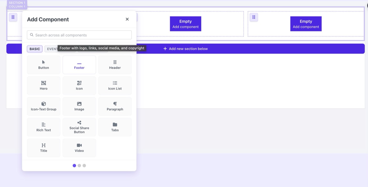
BASIC components tab in the Add Component panel